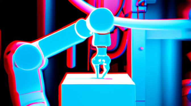
Contact us now
+1-888-846-1732

Using Modern Data Visualization Methods in Business Reports

Using Modern Data Visualization Methods in Business Reports

Business reports can be made more comprehendible through use of modern data visualization methods.

Quantitative data is an essential component of a business report. In fact a great deal of an executive’s time is spent in collecting the data that forms the core essence of a business report. However, when it comes to presenting the data, people tend to be extremely conventional.

No one ever bothers to find out the functionality of multitudes of chart types that are provided by spreadsheet applications. Data visualization methods like the Radar chart, Scatter chart etc are dismissed as purely technical, when in fact these charts have an enormous business application. So, in this article I will discuss the benefits of incorporating Waterfall charts and Funnel charts in business reports.

Let Waterfall Charts do your Sums

Some forms of business reports require that you demonstrate how positive and negative data values add up to arrive at a final value. A simple example of this is an income expenditure statement where sum of all expenditures is subtracted from sum of all incomes to determine the magnitude of available cash.

The general practice is to tabulate this data in a format which is similar to a bank statement. However, this results in an uninteresting presentation of data. Another disadvantage of this method of data presentation is that, a person going through the report may tend to overlook a significant entry in the table.

A Waterfall chart amicably solves the problem, by presenting positive and negative values in distinctive ways, and it also displays the auto-calculated sum of all positive and negative values. The advantage of using a Waterfall chart is that it facilitates instantaneous comprehension of data.

Filter Data Through a Funnel Chart

When it comes to showing a process flow model, block diagrams are ideal and therefore they are widely used. But you can’t associate a quantitative magnitude with each module or a block of a process flow diagram. To indicate quantity while showing transition from one step to another, you can use a Funnel chart.

The Funnel chart is ideal for illustrating a process which involves filtering or elimination at each successive level. In HR reports, funnel charts can be used to show the outcome of recruitment programs.

Apart from making business reports more effective, modern data visualization techniques also help in making them more exciting.